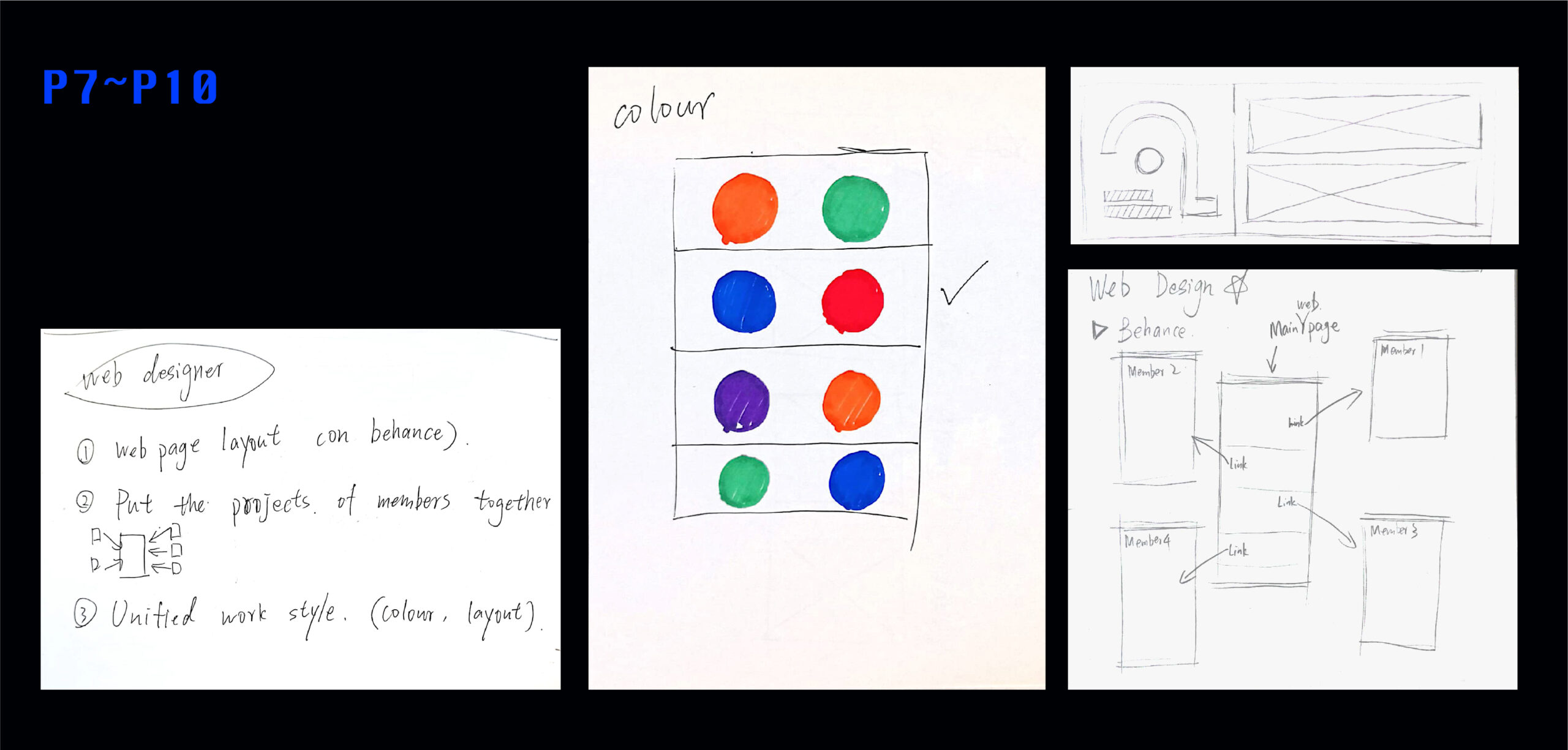
My role in Project 3 is a web designer, and I am mainly responsible for integrating the work of all team members into one web page to increase the unity of the project.
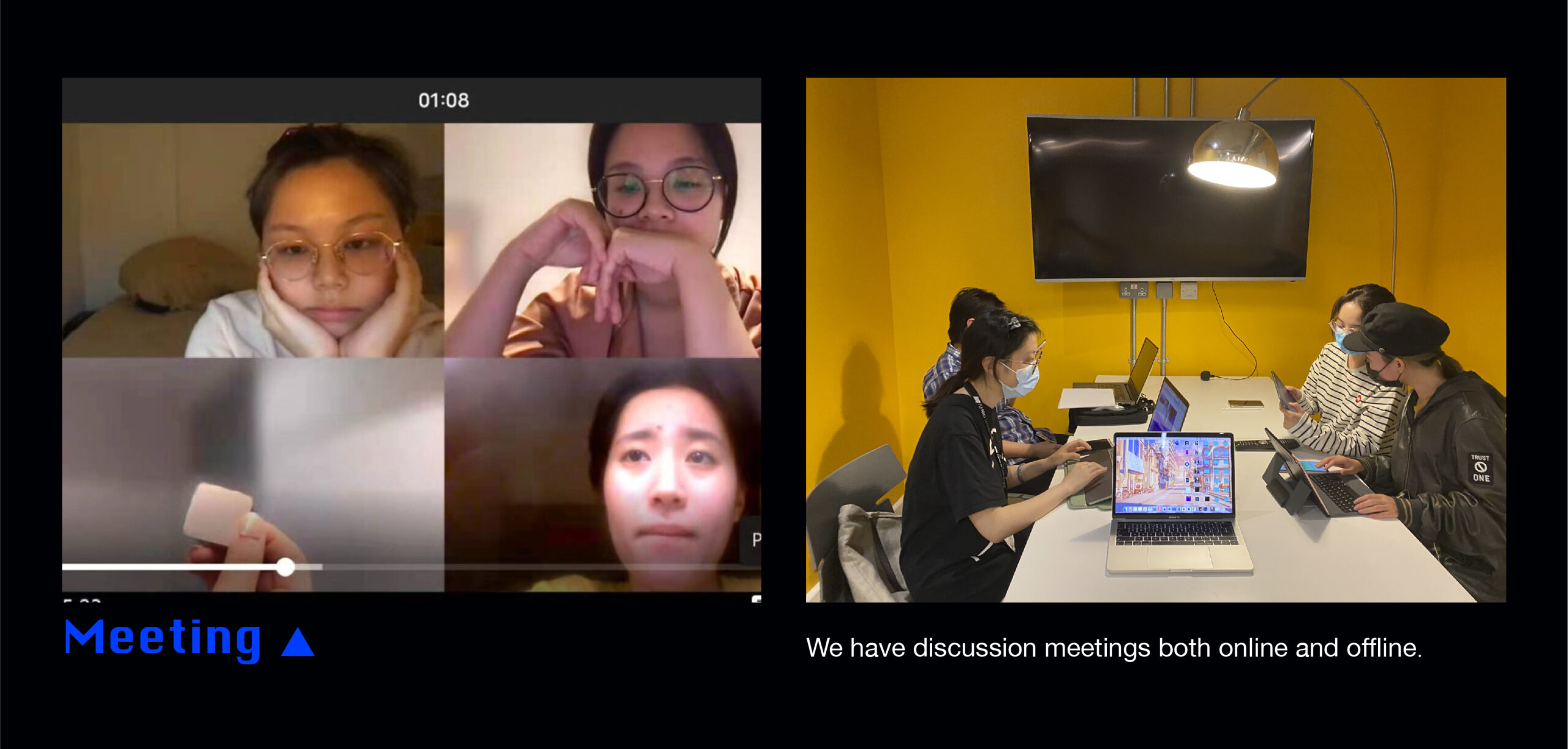
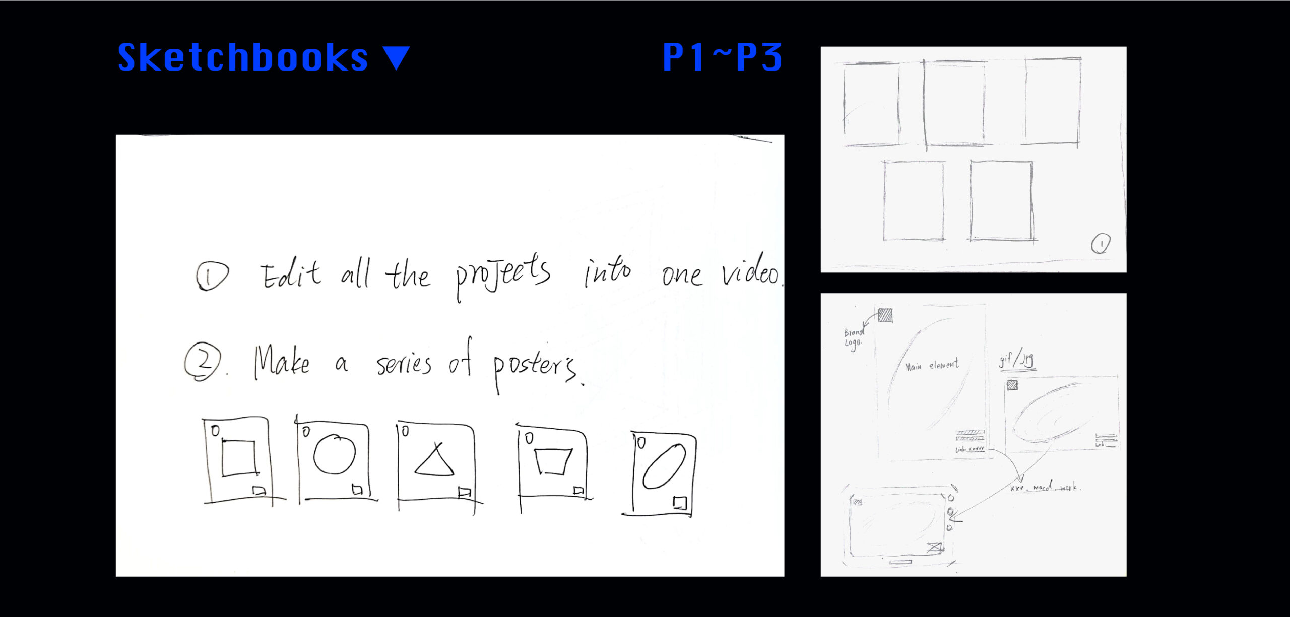
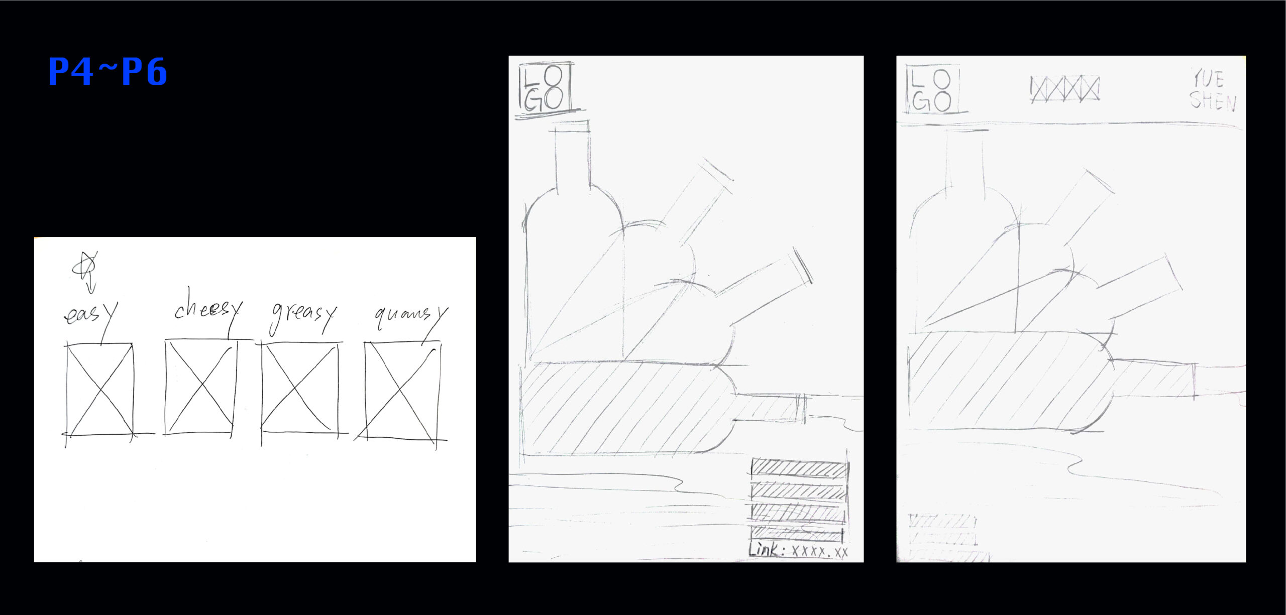
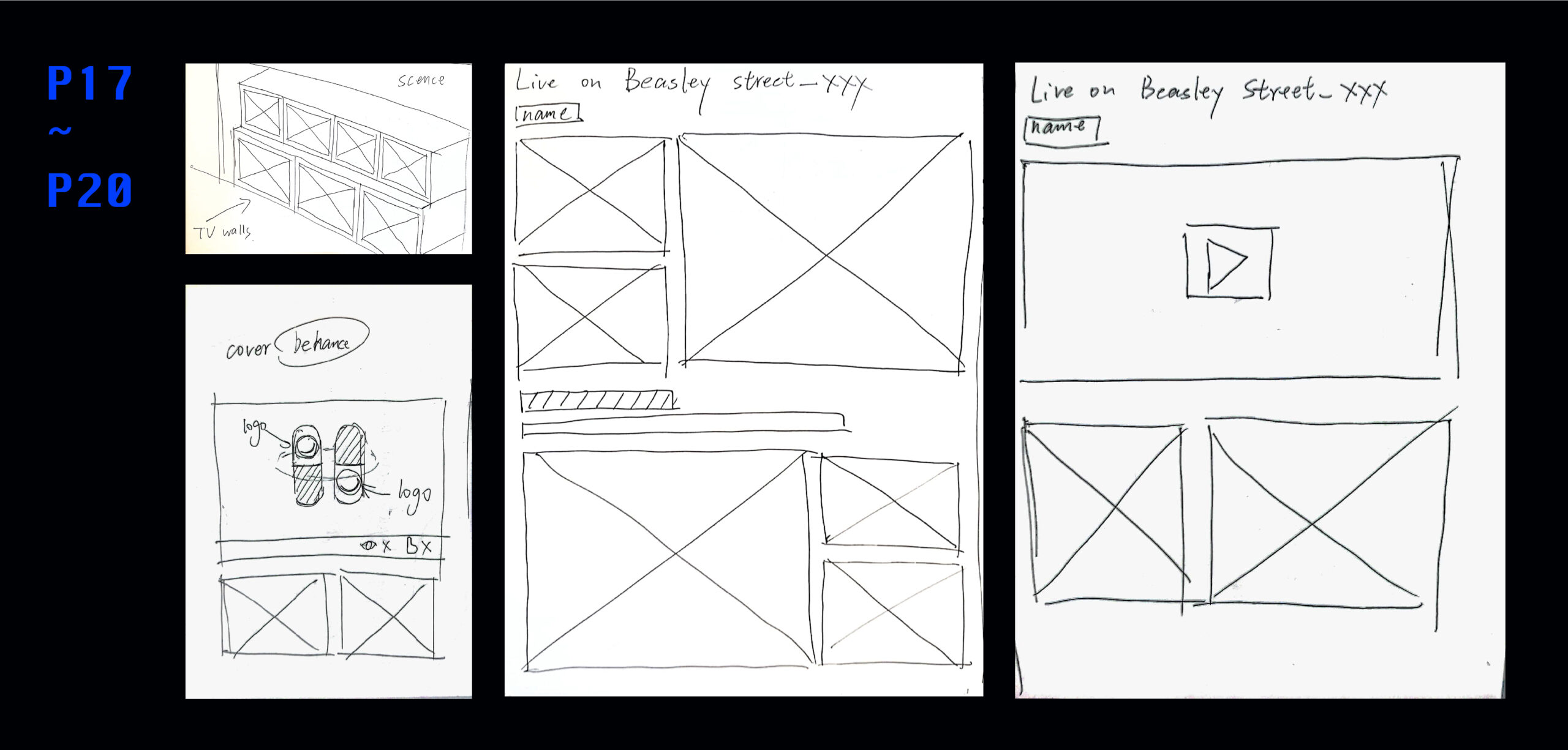
In our first meeting and discussion, we had three ideas for the integration of the project: The first is to use the modeling technology of one of the team members to put our work into a scene, such as a TV wall on the street. The second is to edit each of us’s work into a video, and then edit them together. The last idea is to make a series of posters. Each poster uses the main elements of each team member’s project and has a unified style. Finally, each poster is marked with a link to the work so that readers can see each team member’s work through the link.
After discussion, we believe that because everyone’s work styles and presentation methods are very different, we gave up the second idea. Because the second idea needs to edit everyone’s homework again, which is very difficult for the unification of style. In the end, we decided to let a team member who can model to realize the first idea, and I will be responsible for the layout of the third idea on the web.
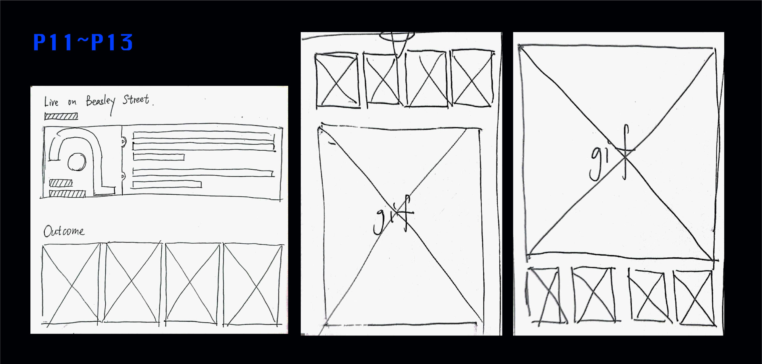
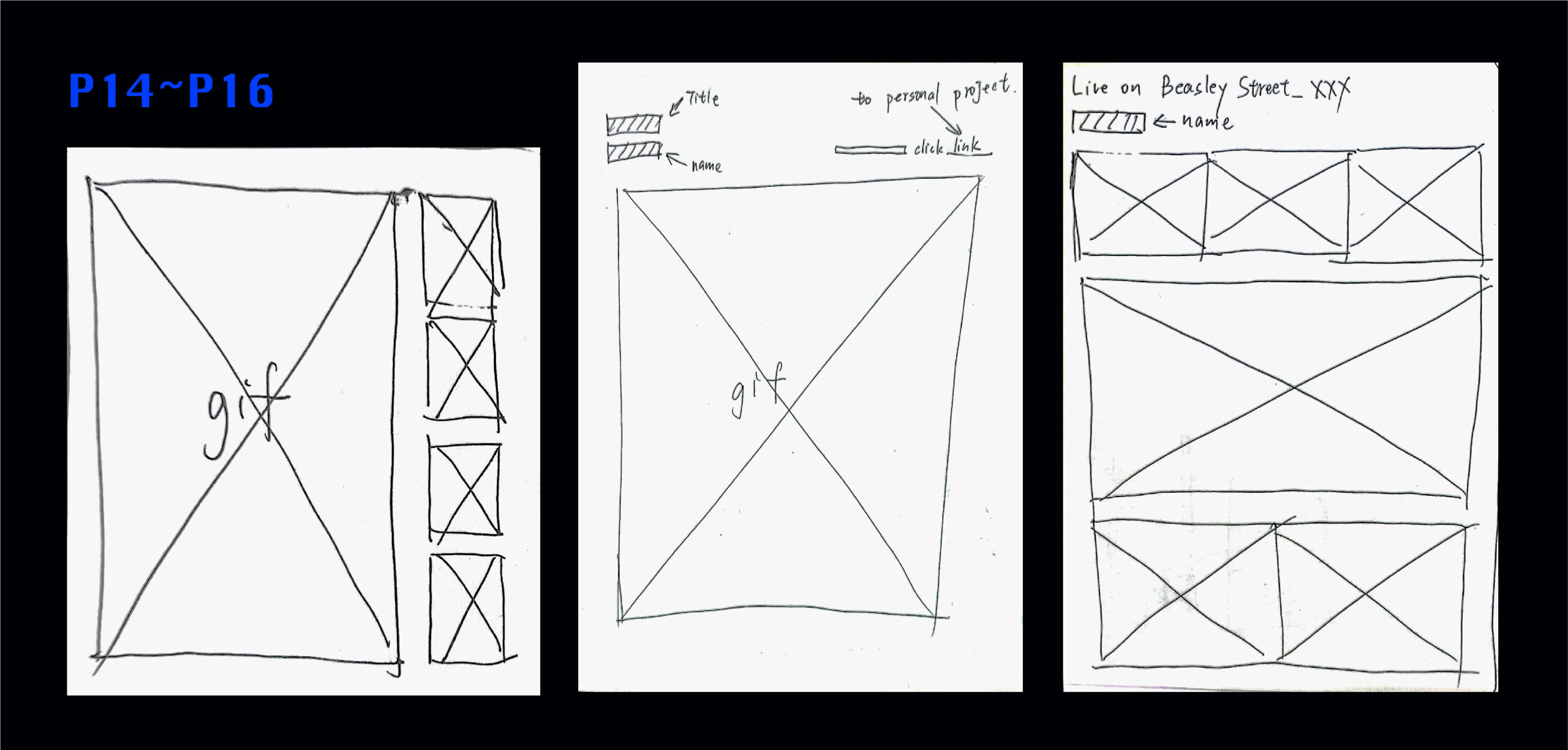
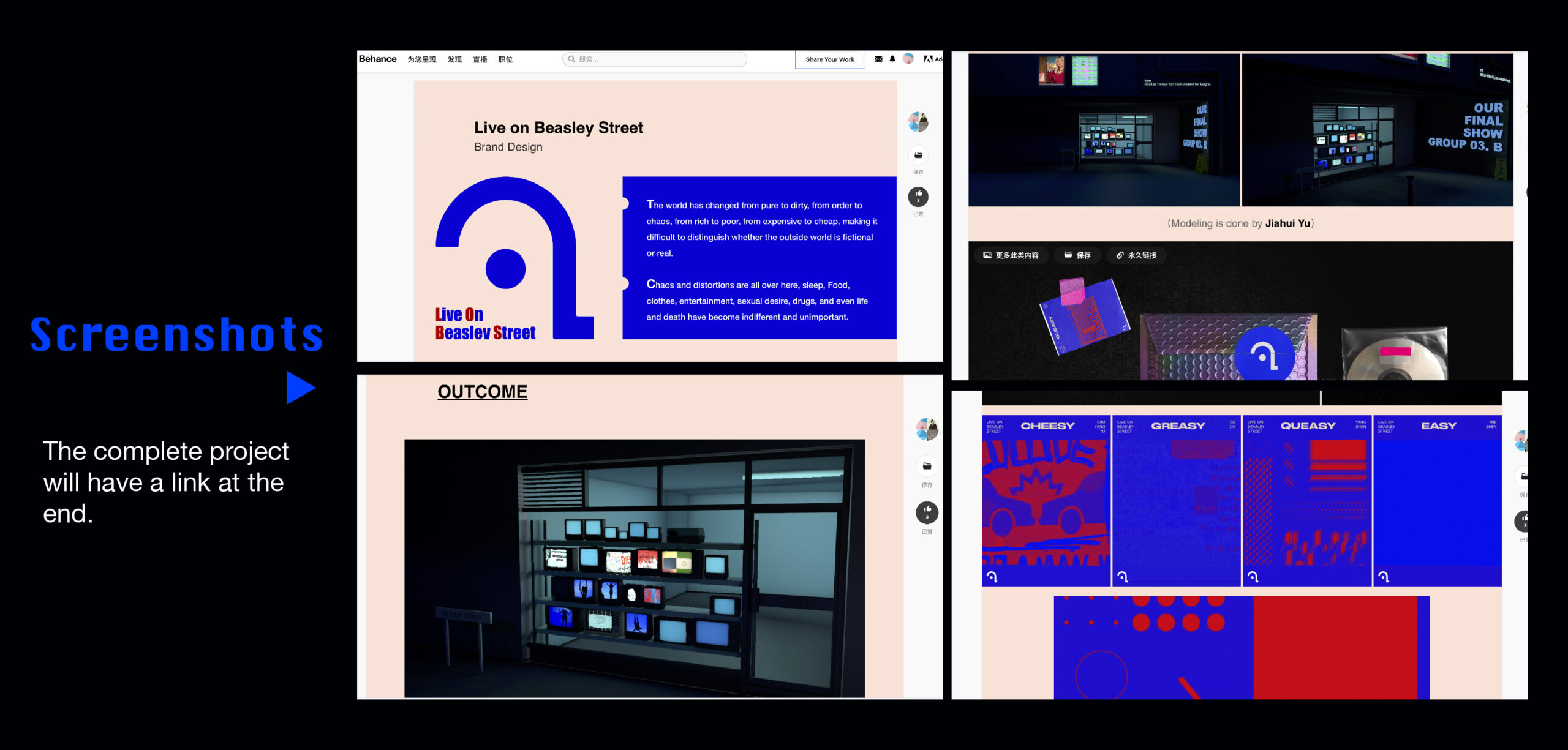
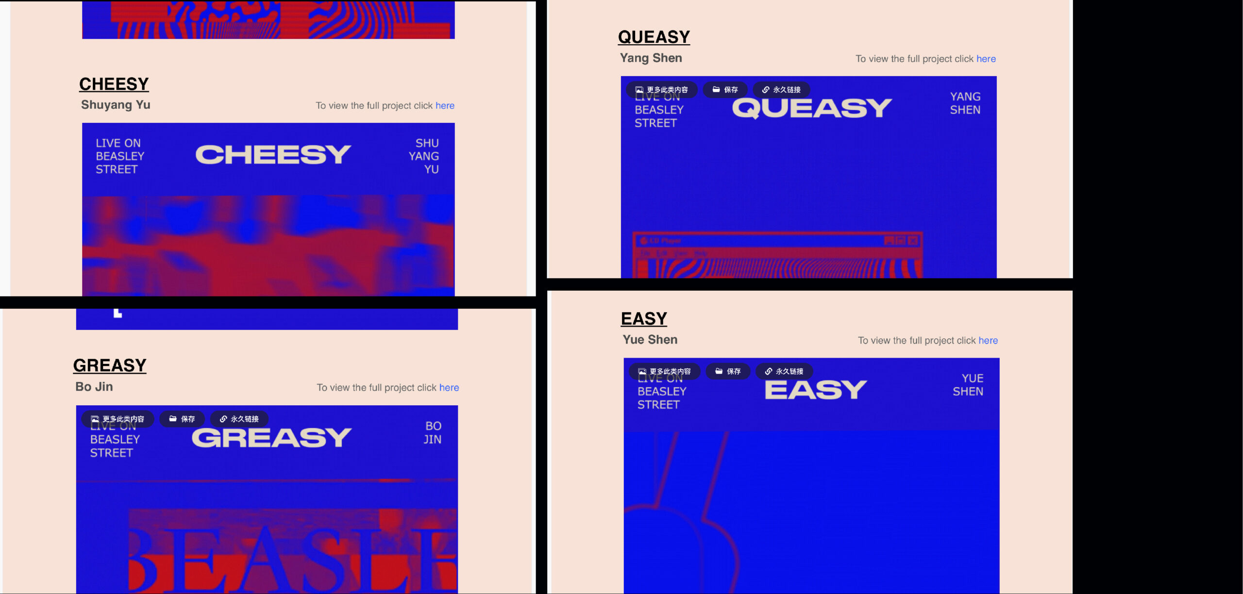
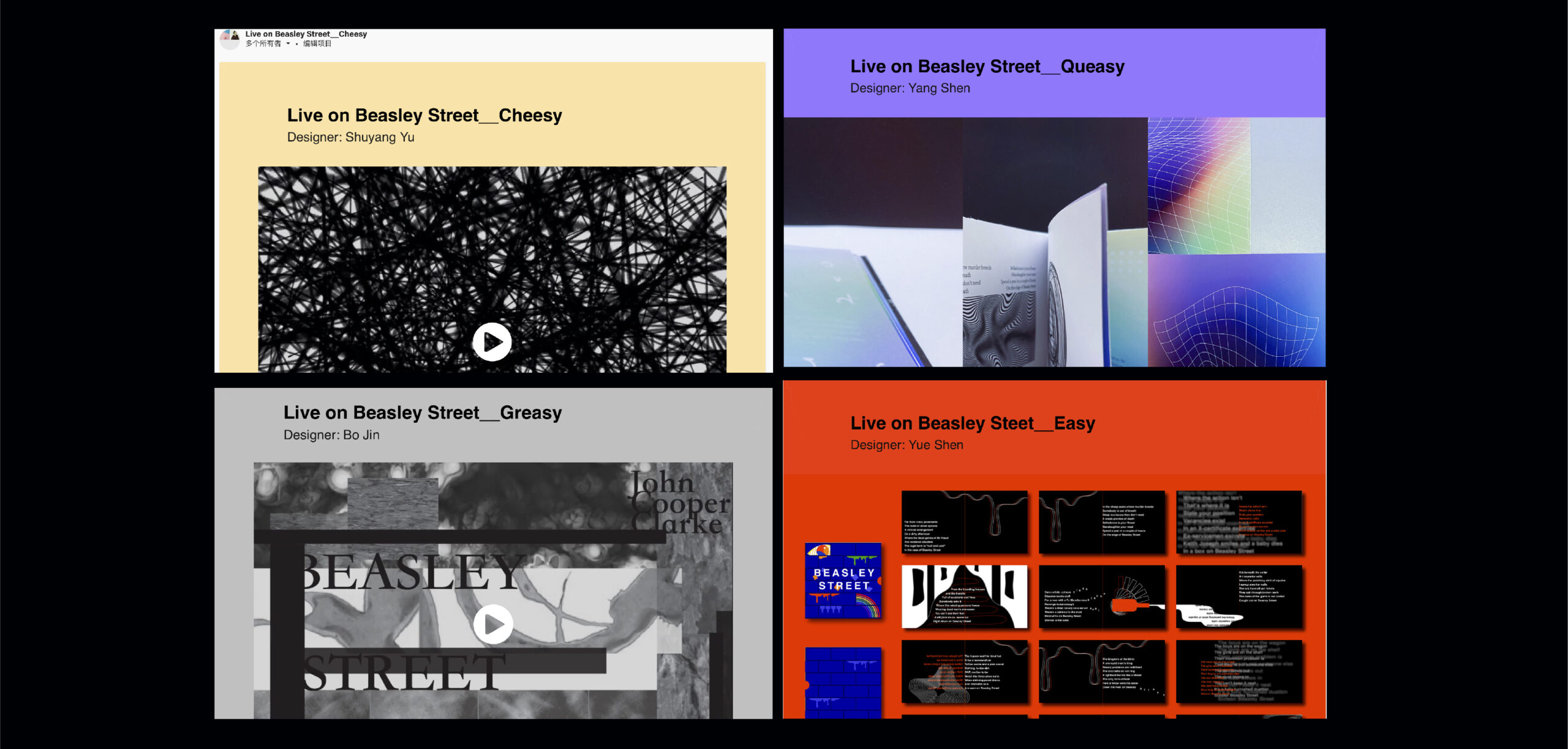
I decided to post the work on the behance website, because there are many people who love design on this website, as well as professional designers, so this work will be widely disseminated. And the layout of the web page is clear, and will not affect the style of the work itself. First, we determined the overall color scheme of the series of posters: red and blue. I put the brand logo and concept introduction at the beginning of the webpage, so that readers can clearly know the theme and style. The four dynamic series posters are placed side by side below, which are the elements of our team members’ personal works. You can see the difference between the works of different team members under the same style, retaining the “same” and “different”, which is also the purpose of the project three we want to achieve. Below the four series of posters is a dynamic poster that integrates the four posters. In addition to the posters in the “outcome” area, there are also scenes of the “TV wall” built by the team member who responsible for modeling, and some derivatives printed with elements of our works. Because the poster display alone will make readers feel unreal and distanced, and the scenes and derivatives will appear richer, allowing readers to feel the work more intuitively in the scene. For the background of the webpage, I used a fleshy pink with low saturation to neutralize the strong visual impact brought by the contrast between red and blue. The overall look is strong but harmonious. For the cover of the work, I used the pill elements made by the team member in charge of modeling. A red pill and a blue pill are engraved with the brand name and our logo. The black background looks more mysterious and attracts readers first eye attention.
In this project, I think we have integrated each other’s projects very well, but we have also retained the differences in our respective projects, and successfully completed our initial vision for the project. But I have some regrets in the layout. I think that my links and work jumps are relatively monotonous, and some of them weaken the highlights of the project. In the future, I will study how to make the link settings more diversified.
The link of the whole project: https://www.behance.net/gallery/124613043/Live-on-Beasley-Street
