

Outcome 01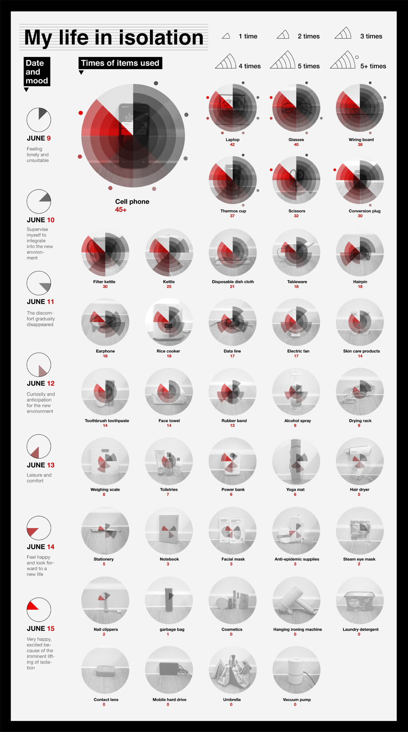
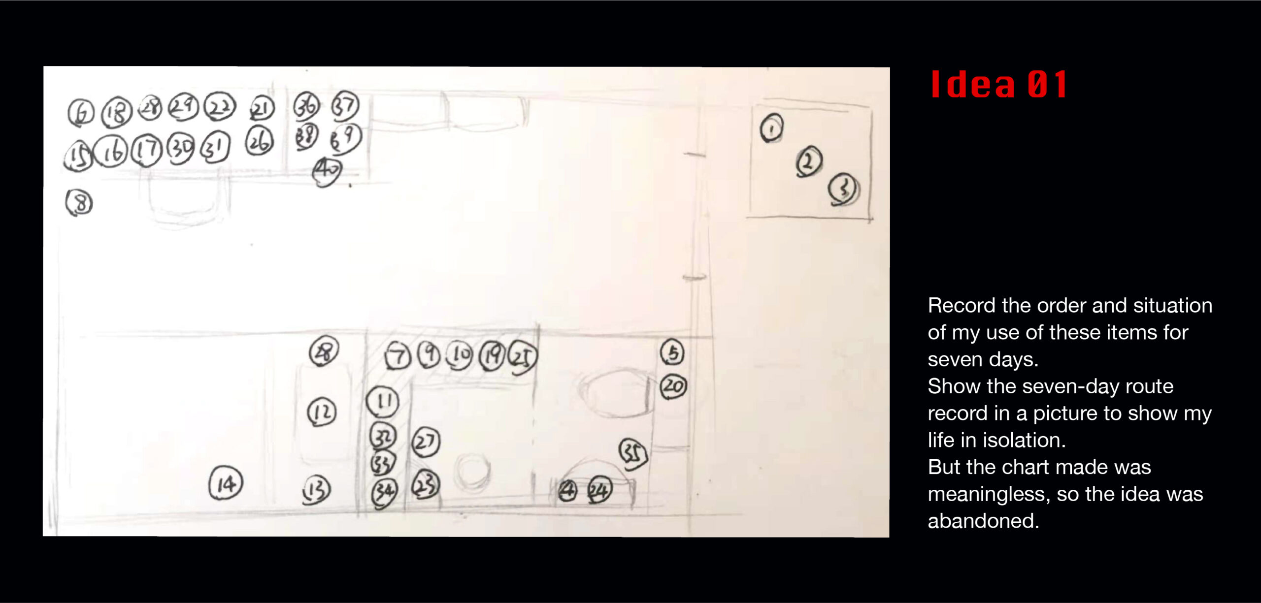
On this basis, I decided to take the photos of the top five most frequently used items as the bottom, and use the linear change graph as the top layer to present a dynamic form.

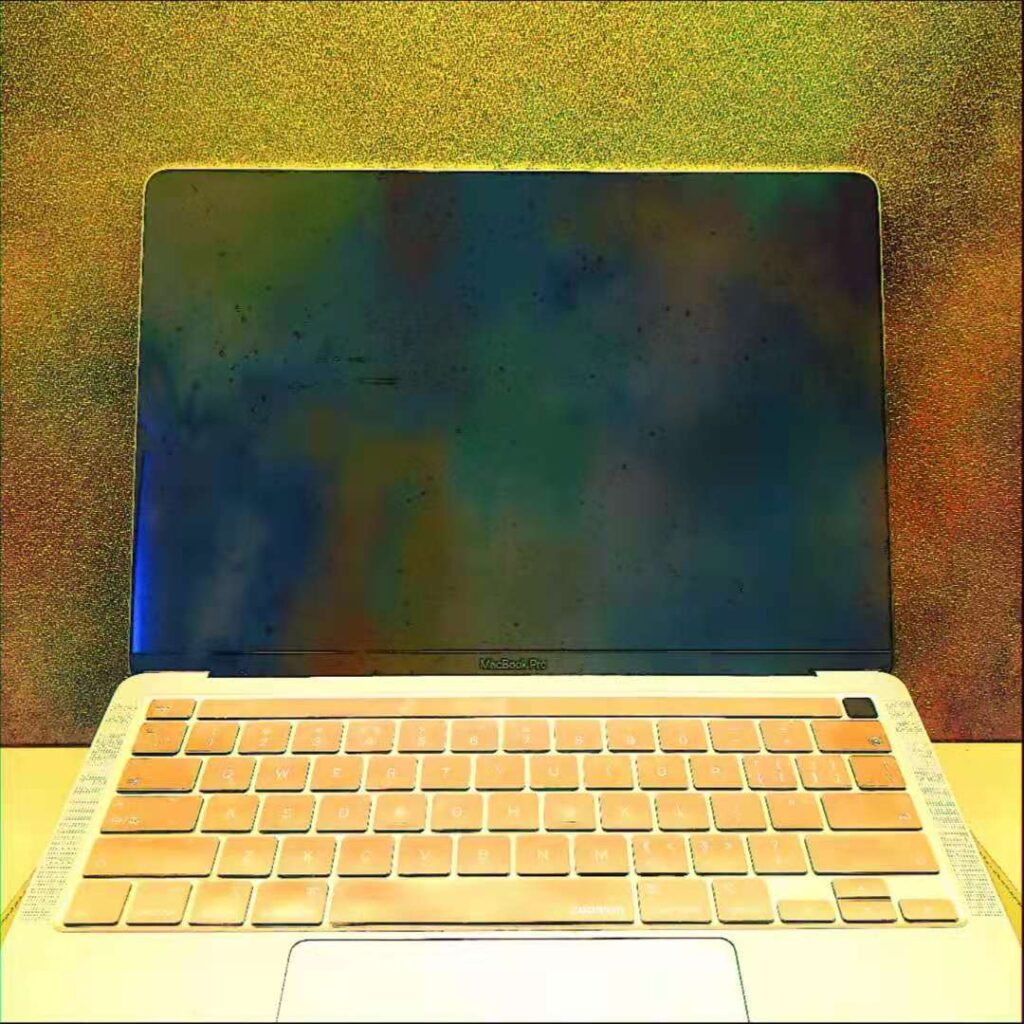
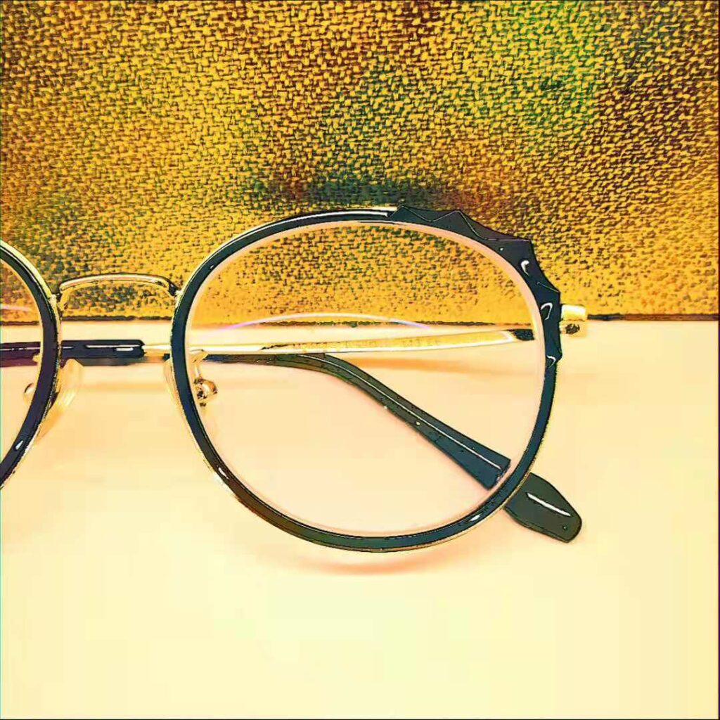
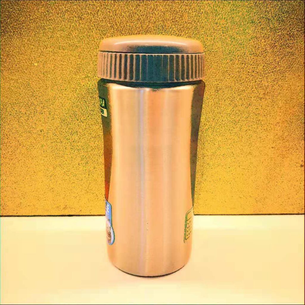
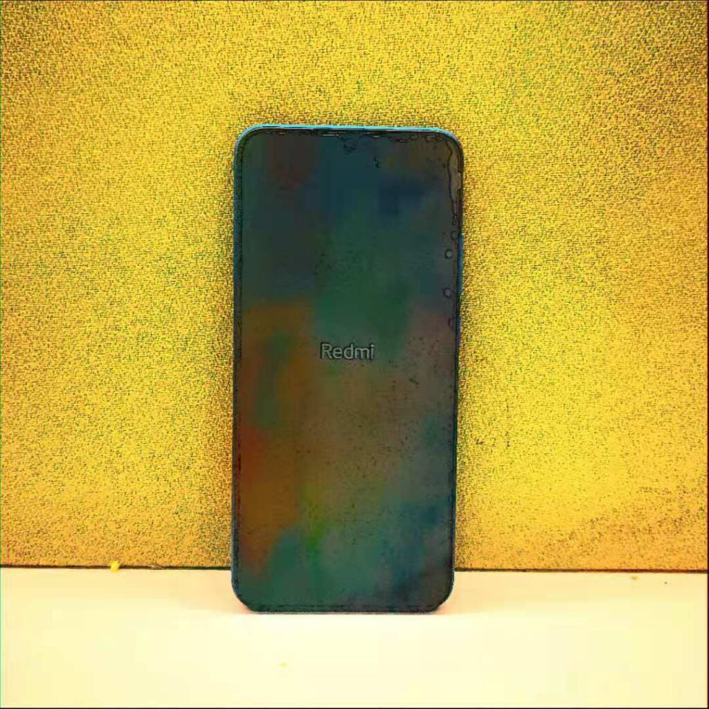
I processed the picture into a lower quality color to increase the visual impact of the picture.
OUTCOME 02
https://www.behance.net/gallery/126396045/Outcome-02?
(If the screen does not move after clicking the play button, just drag the progress bar.)